Image - 2026-09-23 10:55
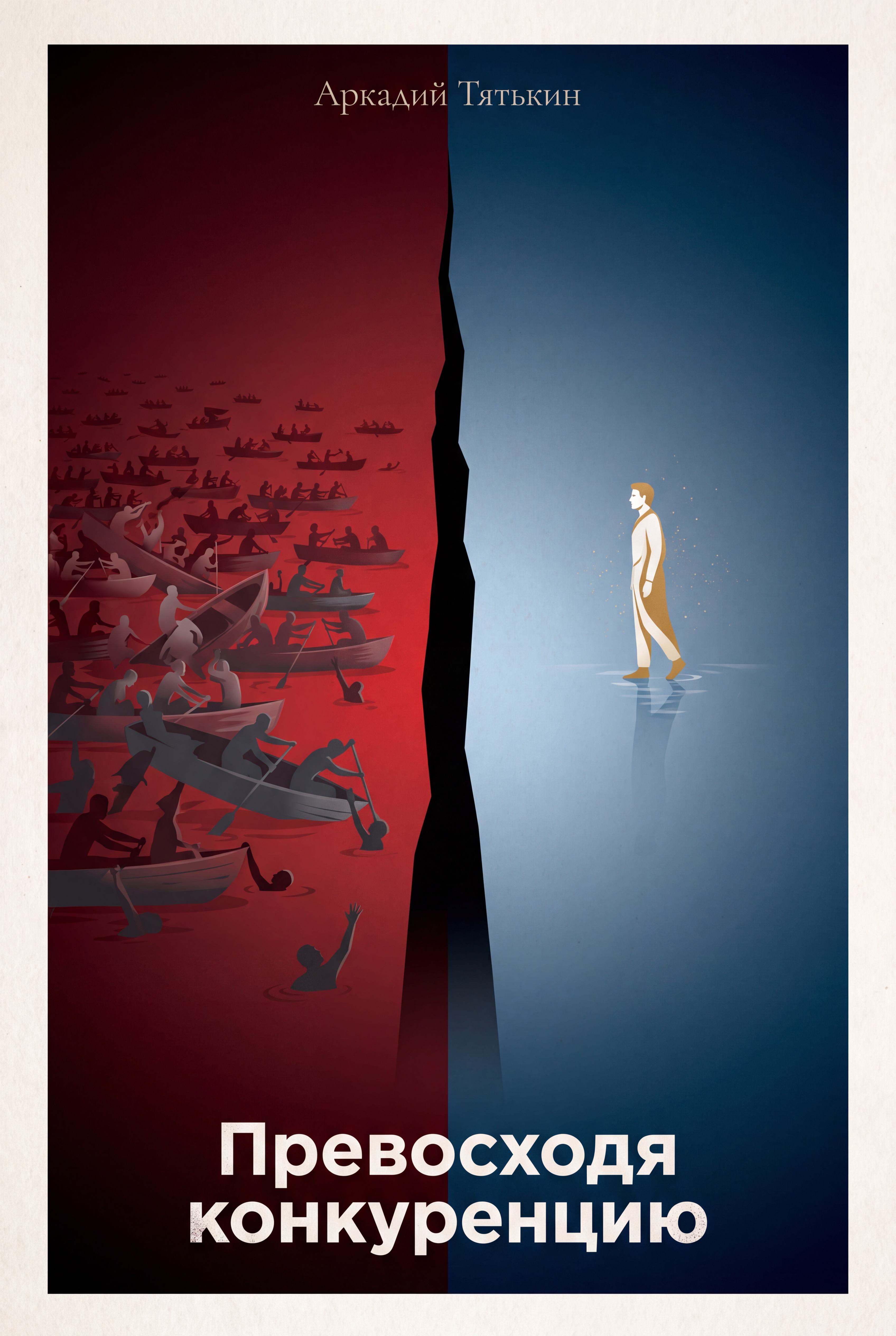
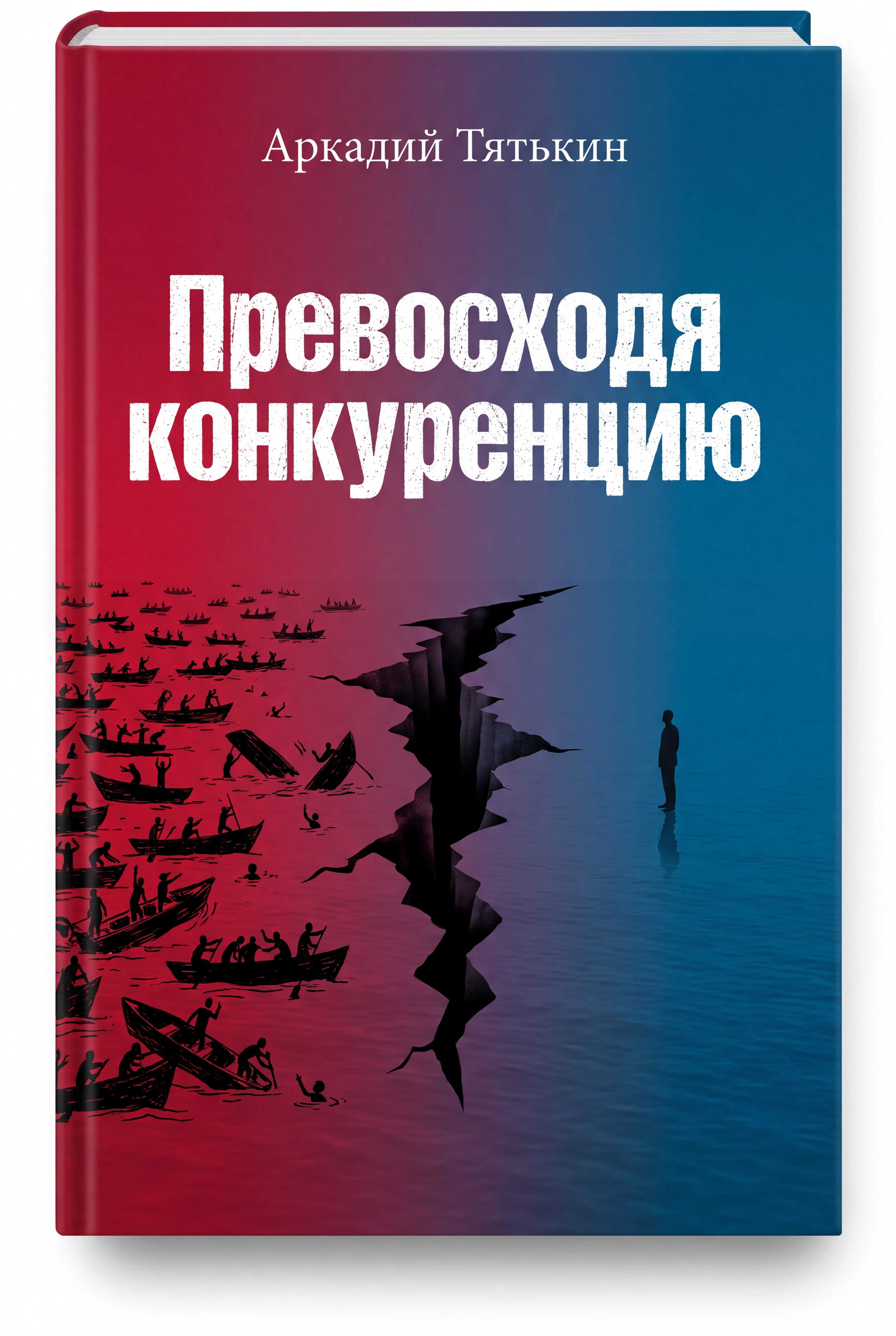
Vertical book cover illustration, front cover only, 2:3 ratio. A bold, simple, powerful illustration in the style of modern minimalist nonfiction — like "Стратегия голубого океана" meets a provocative business fable. The composition is split HORIZONTALLY — left to right — into two distinct zones, creating a dramatic contrast between two states of being. LEFT ZONE: deep crimson red gradient, dark and aggressive, shifting from almost black at the far left edge to a muted dark red toward the center. In this red zone: hundreds of tiny silhouettes in small boats. They are rowing. They are exhausted. They are sinking. Some boats are half-submerged. Some figures are falling into the water. Some are reaching up desperately. The crowd is dense, chaotic, desperate. They are drawn in dark muted tones — almost lost in the red. The mood is suffocating, competitive, hopeless. RIGHT ZONE: deep ocean blue gradient, calm and clean, shifting from deep navy at the far right edge to a soft pale blue toward the center. In this blue zone: empty. Just water. Calm, still, glassy. And ONE single figure — standing ON the water. Not in a boat. Not rowing. Standing. The figure is upright, calm, looking LEFT toward the red zone. The figure is not gloating. Not triumphant. Just standing. Watching. Understanding. Around the figure: a few faint golden dust particles. THE DIVISION between the two zones is NOT a straight line. It is a RIFT — a dark vertical gap, as if the water has parted. The rift is narrow but deep, pure black in the center, fading slightly at the edges. It runs vertically through the entire composition — from top to bottom. But it does not touch the very top or very bottom edges — it fades slightly before reaching them. The figure on the blue side is looking at the red zone. Not with contempt. With understanding. It has been there. It knows. The crowd in the red zone is drawn in muted dark red and gray tones — cold, tense, anonymous. The single figure on the blue side is drawn in warm gold and pale blue tones — free, calm, individual. Color palette: deep crimson #8B1A1A, dark red #5A0A0A, deep ocean blue #0A1A2F, calm blue #1E3A5F, warm gold #C9A227, pale off-white #F5F0E8, dark silhouette #0A0A0A. Texture: subtle paper grain, slight vignette in the corners, minimalist flat illustration style. Style: minimalist conceptual nonfiction cover, bold split composition, clean lines, subtle symbolic details, memorable. TYPOGRAPHY — MUST BE EXACTLY AS WRITTEN: - TOP, centered, thin elegant serif font, small size, pale off-white color: "Аркадий Тятькин" - BOTTOM, centered, large bold sans-serif font, slightly distressed, pale off-white color: "Превосходя конкуренцию" COMPOSITION RULES: - Top quarter: clean dark space on both sides for author name. - Center: the horizontal split with the red chaos on the left and the blue calm on the right. - The vertical rift in the center, not touching the very top and bottom edges. - The single figure standing on water in the blue zone, looking left. - Bottom edge: clean dark space for the title. - Nothing important touches the edges — at least 5–10 mm of empty space around the perimeter. - The illustration should be simple and readable even in a small size. Mood: bold, simple, powerful, philosophical. The feeling of standing between two states — and choosing the calm one. Not by winning, but by leaving the red chaos behind. The rift is not a wound. It is a door. No watermarks, no frames, no borders, no clutter, no realistic details.

Free to start · Generate videos and images with AI in seconds
More from this creator

More Kie.ai images
См. все →