Image - 2026-07-26 16:57
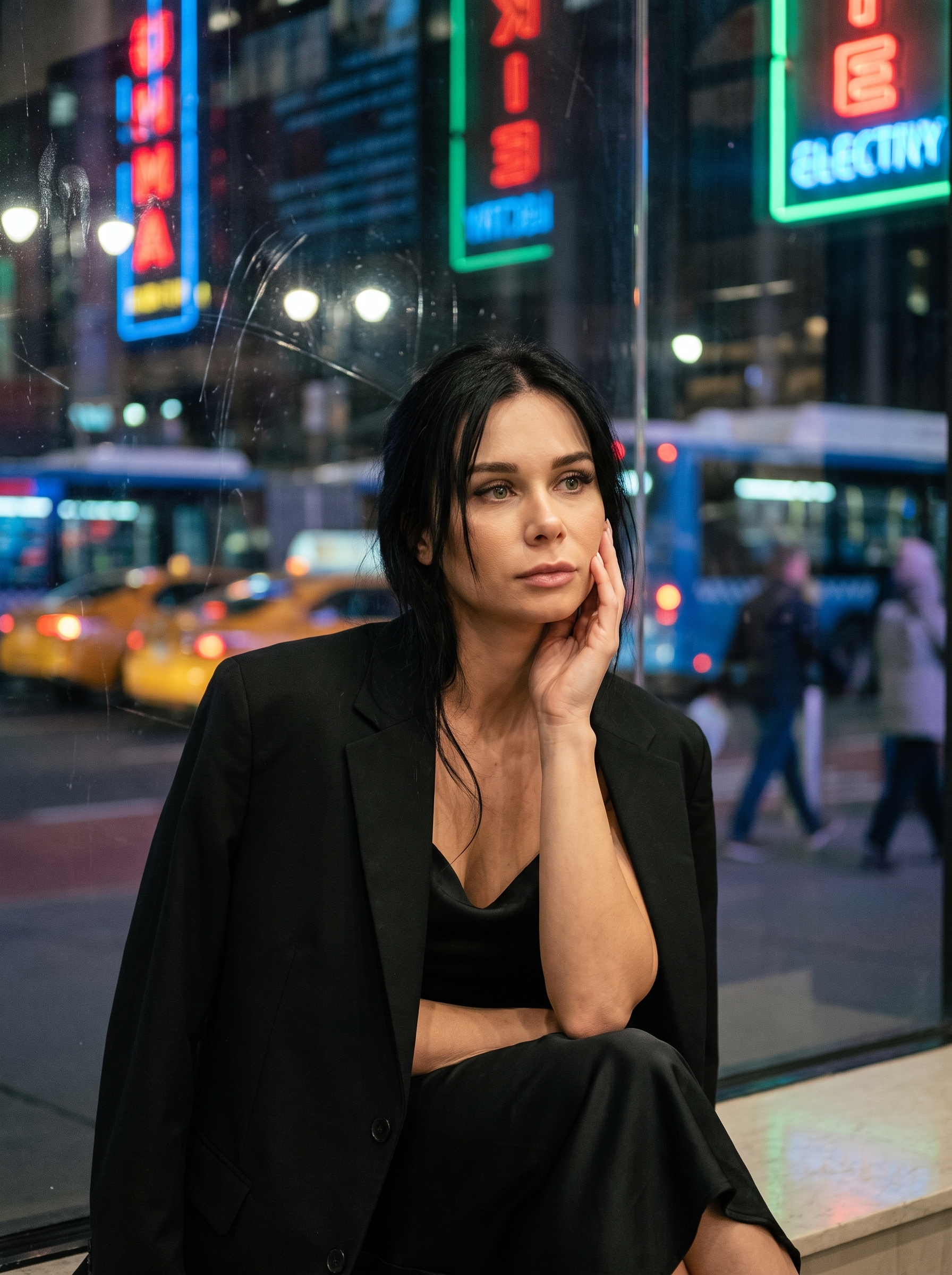
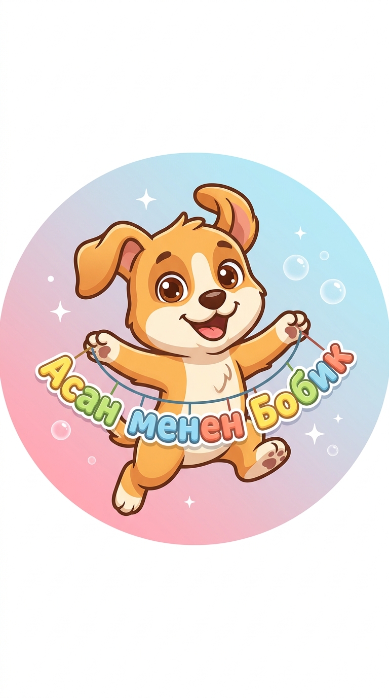
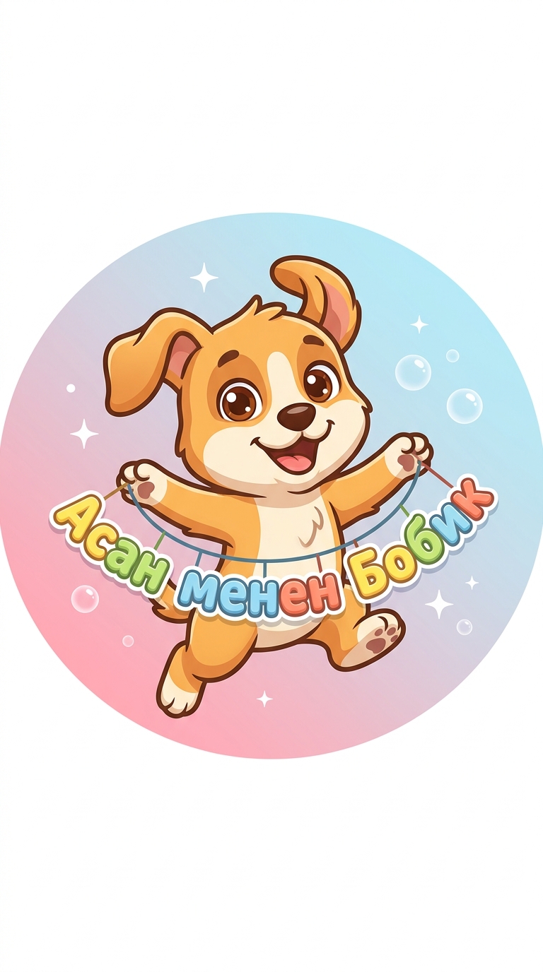
Here is a detailed, rich description of the final logo as if you are looking directly at the finished, high-resolution artwork: The Overall Impression At first glance, the logo radiates pure joy, warmth, and a welcoming energy. It is framed within a perfect, clean circle—specifically optimized to stand out as a YouTube avatar. The design strikes a perfect balance between professional vector art and a cozy, heartwarming cartoon style. It feels modern, polished, and instantly tells the viewer that this channel is a place for fun, friendship, and positive vibes. The Star of the Show: Bobik Right in the center of the frame is Bobik, a cartoon puppy who looks like he just leaped out of a high-end animated movie. The Pose: He is frozen mid-air in a dynamic, joyful jump. His body is angled slightly, giving the image a sense of motion. His front paws are stretched out wide to proudly hold up the channel's name, while his back paws are tucked in playfully. His floppy ears are swept upward by the wind of his jump, adding to the sense of lively movement. The Face: Bobik’s expression is incredibly endearing. He has massive, round, glossy eyes of a warm chestnut-brown color. Inside his eyes are prominent, sparkling white light reflections (shines) that make him look full of life, curiosity, and affection. He has a wide, happy, open-mouthed smile, showing a little pink tongue that adds a touch of mischief. Colors & Details: His fur is a vibrant, warm honey-orange, with a soft cream-white patch on his snout and chest. Instead of harsh black outlines, the artist used a soft, dark-chocolate brown for the contours, which keeps the character looking soft, friendly, and gentle. The Festive Garland & Channel Name Draped between Bobik’s front paws is a colorful, festive garland that curves gently like a happy smile. The Text: Hanging from a thin, clean line are the letters spelling out the channel's name: "Асан менен Бобик". The Font: The letters are custom-designed with a chunky, rounded, "bubbly" font. They have no sharp edges, making them look safe, playful, and toy-like. The Colors: Each letter is painted in a different bright, cheerful color—alternating between sunny yellow, fresh lime green, sky blue, and warm coral. To make sure the text is easily readable even on a tiny phone screen, each letter has a very subtle white outline and a soft drop-shadow, making them "pop" off the background. The Background and Atmosphere The Color Gradient: The background is soft and dreamlike. It features a smooth, seamless gradient that transitions from a gentle, warm pastel pink at the bottom to a light, airy sky-blue at the top. This creates a beautiful contrast with Bobik’s warm orange fur and makes him the absolute focus of the image. The Magic Touches: Floating softly in the background around Bobik are a few tiny, minimalist white sparkles and soft, semi-transparent bubbles. They add a touch of magic, celebration, and youthful energy to the logo without cluttering the clean design. Style and Execution The logo is executed in a premium minimalist vector style. The shading is clean and simple (cel-shading), using slightly darker tones of orange to give Bobik a 3D volume without making the design look busy. The lines are perfectly smooth, ensuring that the logo remains incredibly sharp, clear, and recognizable at any size—whether it's a tiny icon on a smartphone or a giant banner on a smart TV.
Free to start · Generate videos and images with AI in seconds
More from this creator
More L images
См. все →