Image - 2026-07-13 12:29
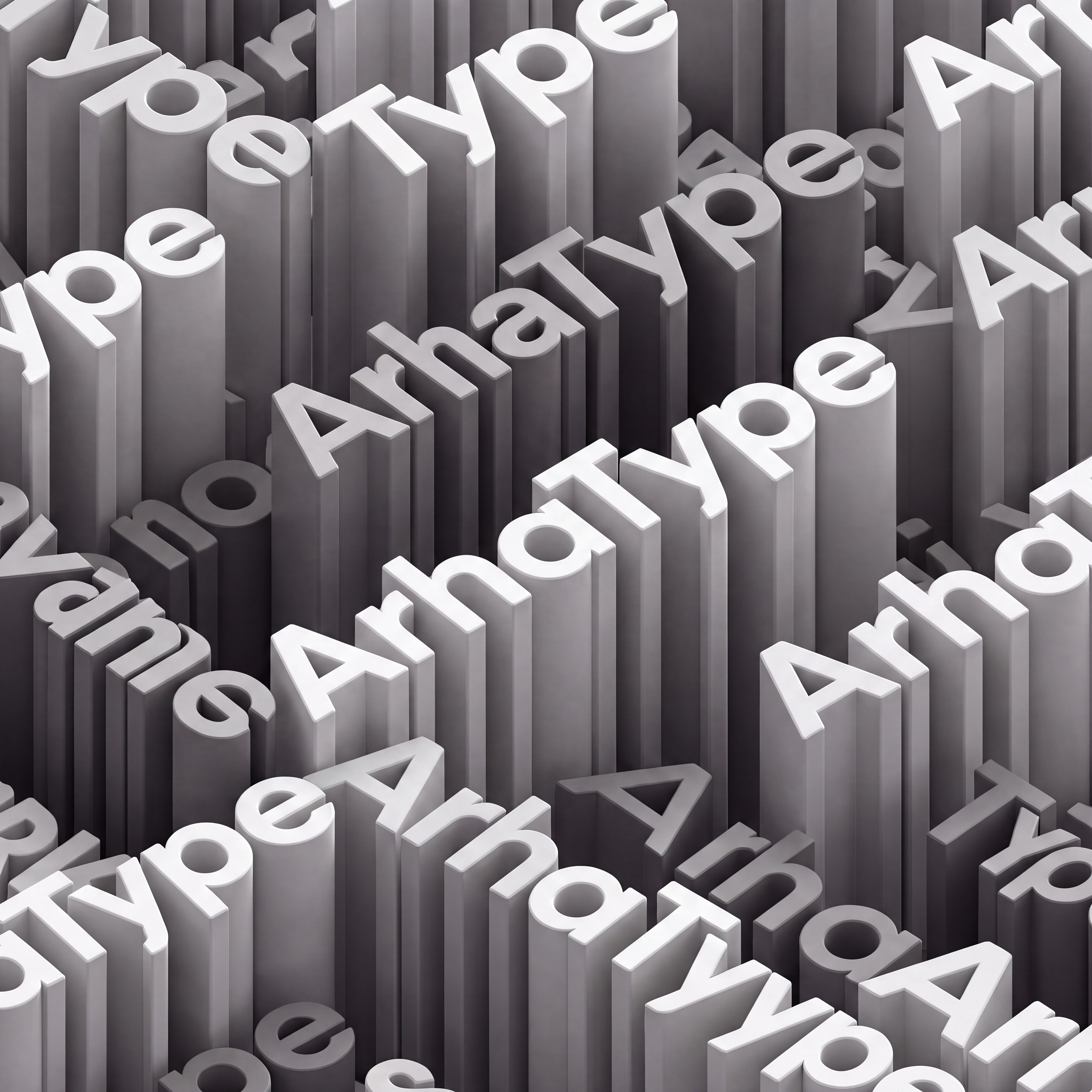
The typeface in the first image is WRONG and must be replaced. This is a targeted font-substitution edit. Everything except the letterforms is already correct and must be preserved. PRESERVE EXACTLY (do not alter): camera angle and isometric projection; the position, rotation and baseline of every single word instance; the tessellated layout and how lines interlock; extrusion depth and the height of every block; the grayscale palette; the matte material; the direction of light, every shadow and every highlight; the framing and crop. The output must be immediately recognizable as the same picture. REPLACE: every glyph of every "ArhaType" instance must be re-cut in the typeface from the second image. The second image is the authoritative specimen — match it, not the base image. The specific errors in the current font that you must correct: — The A currently has a sharp pointed apex. It must instead have a FLAT, horizontally clipped apex — a blunt top, wide stance, low crossbar. — The strokes are currently too LIGHT. They must be substantially HEAVIER — thick, uniform, monolinear, no tapering, no thick/thin contrast. — The a, p and e bowls are currently narrow and slightly oval. They must be PERFECT CIRCLES — wide, geometric, with small tight counters. — The e currently has a large open aperture. It must have a straight horizontal bar and a small, tight aperture. — The r must be a heavy vertical stem with a short, blunt, flat horizontal arm — no curve, no flare. — The T must have a long, thick, flat crossbar. — The y must have a straight diagonal meeting a vertical descender ending in a small horizontal foot. — Overall: heavier weight, wider and more geometric, taller x-height, more even spacing than the base image. Rebuild each letter with the corrected shape, re-extrude it to the same depth it had before, and re-light it to match the existing lighting exactly. The words stay upright and readable along their original baselines — never mirrored, never rotated. Spelling stays exactly "ArhaType" — capital A, lowercase r, h, a, capital T, lowercase y, p, e. If the output letterforms look the same as the input, the edit has failed. The new letters must be visibly bolder, wider and more circular. Negative prompt: unchanged typeface, original font retained, thin strokes, light weight, pointed A apex, sharp triangular A, oval or narrow bowls, tapering strokes, stroke contrast, condensed, serif, italic, changed camera angle, changed layout, changed lighting, new composition, misspelled letters, "ArchaType", "Archetype", background visible

Free to start · Generate videos and images with AI in seconds
More by Taupe Dog
См. все →
More L images
См. все →