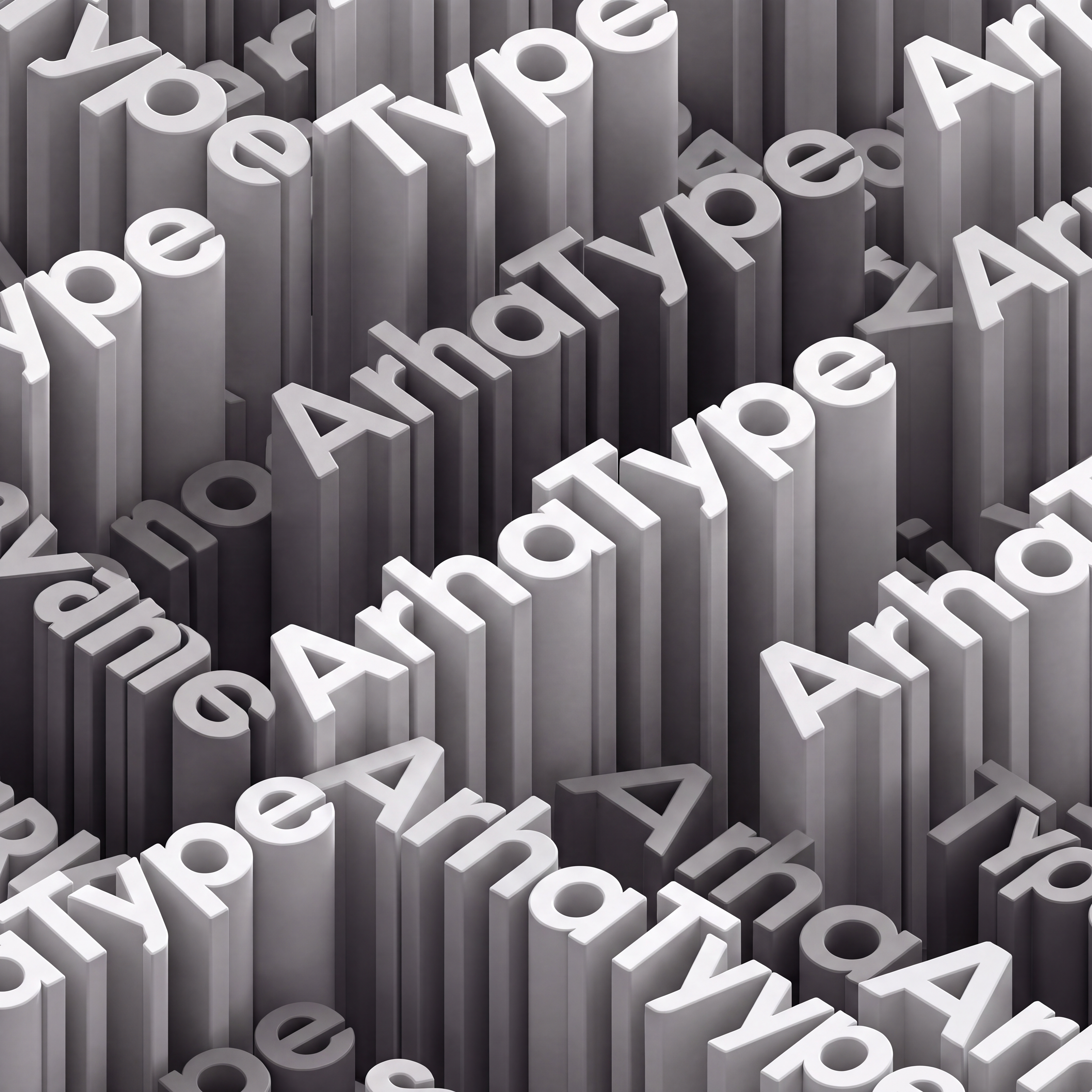

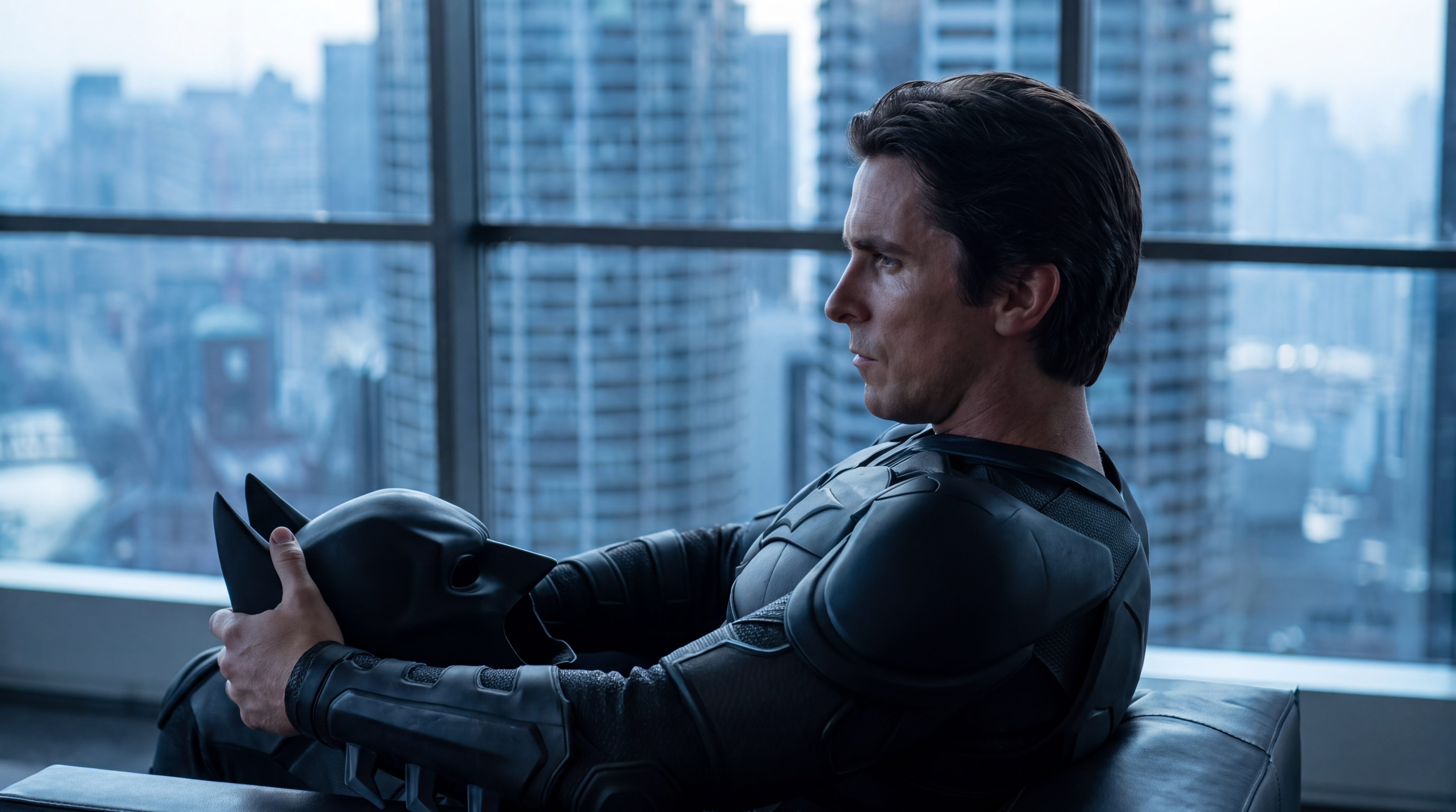
This is a font-replacement edit, not a new composition. Take the FIRST image as the base and keep it essentially unchanged: identical camera angle and isometric projection, identical layout and tessellation of the repeated word "ArhaType", identical text direction and line flow, identical extrusion depth and block heights, identical grayscale palette, identical matte material, identical lighting, shadows and highlights, identical framing and crop. The overall image must remain recognizably the same picture. Change ONE thing only: the typeface. Re-set every instance of the word "ArhaType" in the exact typeface shown in the SECOND image, which is the authoritative type specimen. Copy those glyphs as precisely as possible — same skeleton, same proportions, same stroke weight, same counters, same spacing. The new typeface is a heavy geometric sans-serif, noticeably bolder and more geometric than the font currently in the base image. Specific differences to apply: — A: flat, slightly clipped apex instead of a sharp point; wide stance; low crossbar. — r: heavy vertical stem with a short, blunt horizontal arm, flat terminal, no curve. — h: thick stem, square-ish shoulder, wide and even. — a: single-storey, perfectly circular bowl, heavy stem. — T: long, thick, flat crossbar. — y: straight diagonal meeting a vertical descender that ends in a small horizontal foot. — p: fully circular heavy bowl. — e: large circular shape with a straight horizontal bar and a small open aperture. — Overall: thick monolinear strokes, tall x-height, generous even spacing, no tapering, no contrast between thick and thin. Every letter block keeps its position, depth and lighting from the base image — only its letterform is rebuilt in the new typeface, then re-extruded and re-lit to match. The text stays naturally readable, upright along its baselines, never mirrored or rotated. Spelling must remain exactly "ArhaType" — capital A, lowercase r, h, a, capital T, lowercase y, p, e. Negative prompt: new composition, changed camera angle, changed layout, changed lighting, changed color, thin or light weight, condensed, serif, slab serif, italic, sharp pointed A apex, tapering strokes, high stroke contrast, altered glyph proportions, misspelled letters, "ArhaTypo", "ArchaType", "Archetype", extra words, background visible
Free to start · Generate videos and images with AI in seconds